“Data is one of those things that’s often overlooked until it’s needed.”
— Clare Rowley, Data and Project Officer, Adelaide Zero Project Backbone Team
The Adelaide Zero Project — initially launched in 2017, and supported by Built for Zero through regular monthly coaching ever since — is a collaborative effort to end street homelessness for all single adults in Adelaide. In December 2019, the Adelaide Zero Project became the first community outside North America to achieve quality by-name list data — the cornerstone of the Built for Zero methodology throughout the world. Since then, through the thoughtful adaptation and distribution of a monthly report to a wide group of stakeholders, the initiative has also demonstrated that, when communicated creatively and consistently, data can be a powerful tool for advocacy and will-building.
Community-wide accountability
When it comes to ending homelessness, community-wide accountability is key. But it can be easy to “hoard” data and limit public visibility of progress towards a community-wide goal. The team in Adelaide has taken a different approach. Since 2018, the campaign has delivered the Monthly Adelaide Zero Project Data Report, shared with over 30 organizations within and outside of the homeless services sector. The functional zero data points are also provided through a more streamlined version of the report, available on the website for the general public. Infographics were only added to the report between August and October 2020.
“The collective wisdom of the entire Project goes into the report — not just one person. The process behind reporting the data is what makes it so valuable.”
Clare Rowley, Data and Project Officer, Adelaide Zero Project Backbone Team
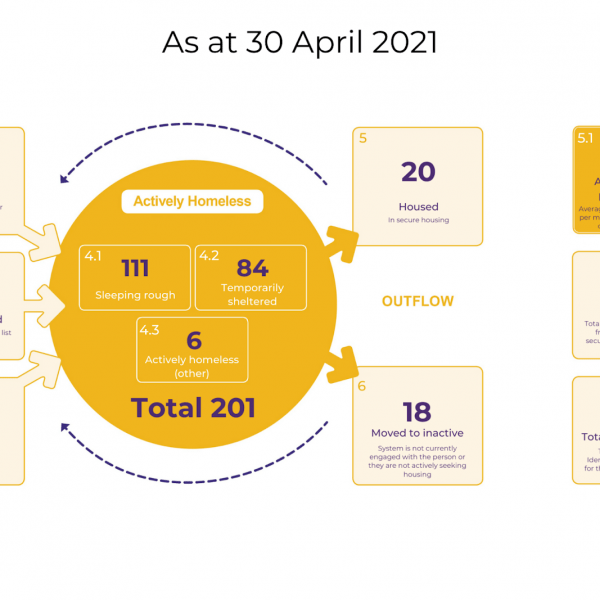
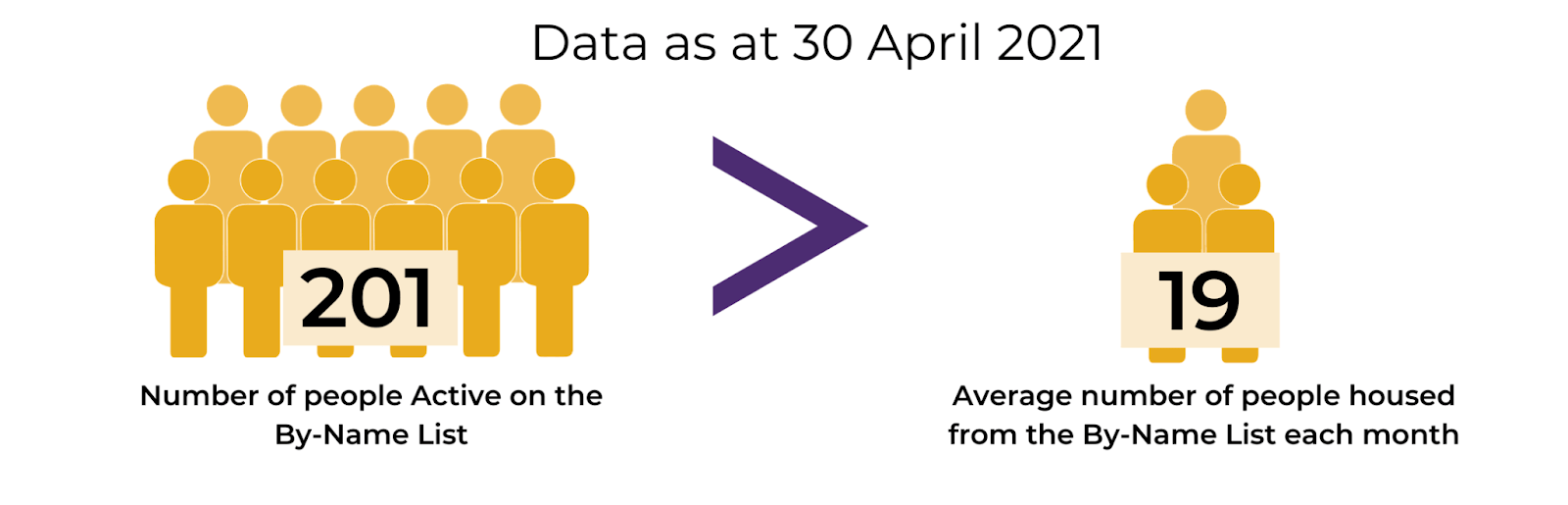
These visualizations show inflow and outflow of homelessness each month, along with how far the campaign is from reaching its goal of functional zero for people sleeping rough. For those recipients who want to dig deeper, the report includes tables that show the data over time to be able to understand historical changes. But even upon a quick glance, readers can see the current state of the community’s homelessness and progress to their goals. This allows the team to translate their data into action — and to generate meaningful improvements to their system as a result.
Before August 2020, the report consisted solely of tables, which only provided the information in one format. “And people read data differently,” noted Rowley. “Some people love tables and some people hate them.” The group that generates and updates the report monthly works with consistent and replicable templates for their visualizations, which allows the team to focus their energy on making use of the data to drive improvements to their system, rather than struggling to generate a new report every month.
The process makes it valuable
Insight into the report creation comes from services managers, technical administrators, communications team members, and a designated data working group. Front-line workers and administration staff are responsible for entering data about the clients they know best. The Data and Evaluation Working Group, consisting of representatives from university partners, homelessness services, data experts, and health, human, and housing services meets regularly to ensure data quality and consistency, and helps develop the key messages gleaned from the data. And the Adelaide Zero Project backbone team produces the demographic run charts and infographics. “The collective wisdom of the entire Project goes into the report — not just one person,” said Rowley. “The process behind reporting the data is what makes it so valuable.”
*CEARS = COVID-19 Emergency Accommodation for Rough Sleepers response
The collaborative nature of the report enhances buy-in across Adelaide, keeping the focus on the shared goal of functional zero. Recipients of the report include leaders of organizations in the Adelaide Zero Project, composed of 30 CEOs and around 40 separate agencies that may be involved in the Project at any one time, plus other homeless service sector agencies. The report is emailed out as a PDF for easy reading, reference, and sharing.
“The team in Adelaide are really good at getting their data out in public, even to those not participating in the movement, to get them involved,” said Rian Watt, Built for Zero Strategy Lead, International & Large-Scale Change.
Creating a feedback loop
As more organizations understand the necessity and utility of clear, comprehensible data visualizations of the progress and work, the team in Adelaide has seen increased engagement with the effort to reach functional zero. Staff and leaders can see why the data is so crucial for the success of the initiative, and in turn, case managers continue to provide real data about people, which data administrators oversee. The subsequent report creates a type of feedback loop, actually changing the way agencies operate, further bolstering the reason to enter data consistently and on time. “The reports give us a more accurate understanding of what’s going on in our housing and homelessness system, helping us to inform more person-centered outcomes for people sleeping rough. They’re a key driver that’s helped us house over 550 people,” said Renee Jones, Senior Coordinator, Adelaide Zero Project backbone team.
Month-over-month data also demonstrates gaps in service or needs of clients, along with the complexity of the needs of the whole cohort on the by-name list. For example, some agencies in the Adelaide Zero Project reported that they were struggling to engage mental health practitioners in their work, so the team leveraged the project’s data to get more mental health partners on board and create shorter-term goals in that area. Rowley said, “It helps us drill down into the ‘whys’ and barriers.”
“The reports give us a more accurate understanding of what’s going on in our housing and homelessness system, helping us to inform more person-centered outcomes for people sleeping rough.”
— Renee Jones, Senior Coordinator, Adelaide Zero Project Backbone Team
Shared data and shared challenges
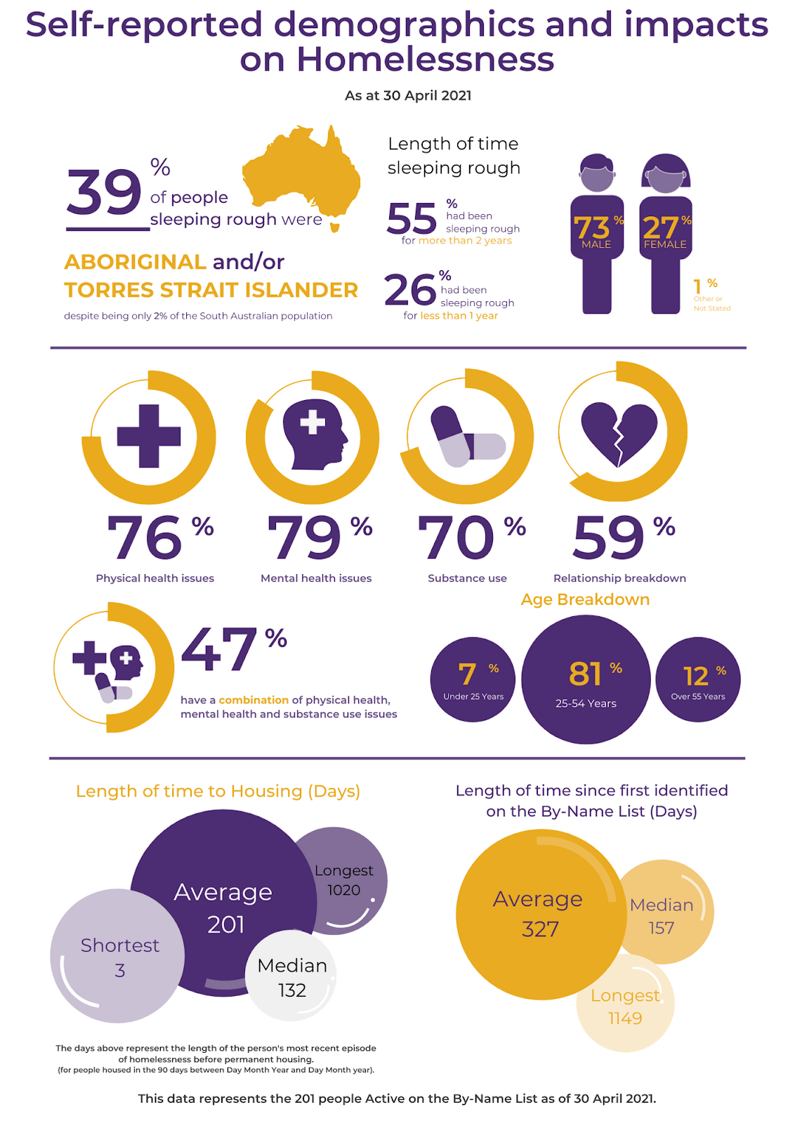
The data in these reports have also been used to track trends and shifts, highlighting them as key messages. Project partners can then use these messages when they’re talking to the community about the project and the data. The team is also able to see how they are doing on reducing rough sleeping amongst specific cohorts including veterans, people under 25 years, people experiencing chronic rough sleeping, Aboriginal and Torres Strait Islander people, and people eligible for additional support through the COVID-19 response, for example. This specific data helps the initiative to quickly see any changes in the community or the system and respond more confidently. “Sometimes the data highlights things that we don’t know about at a community level, but we can dig into the data to find out more,” said Rowley.
“Using shared data, and transparently reporting on it, is critical to tackling shared challenges like homelessness.”
Clare Rowley
The Adelaide Zero Project team hopes to continue making these data visualizations even more widely accessible. “The more data that’s available publicly, the more ways people are accountable and can make a difference,” said Rowley. It is this determination and accountability across communities that can drive the shift that’s needed to end homelessness. As Rowley said, “It’s important we continue to have a real-time understanding of homelessness at an individual level, as well as across a community. Using shared data, and transparently reporting on it, is critical to tackling shared challenges like homelessness.”