With 18 cities and 4,261 square miles of land, San Diego County has a vast and varied landscape, with regions ranging from snowy to sandy and encompassing a population of 3.28 million. In 2022, the media landscape around homelessness was as vast and varied as well.
The Regional Task Force on Homelessness (RTFH), the lead Continuum of Care agency for San Diego City and County, knew that public interest in homelessness ebbed and flowed and that information about different solutions for homelessness did not reach everyone. Local media tended to focus on perceived successes or failures of individual programs. If they covered the bigger picture, it wasn’t typically the whole picture.
Many residents of San Diego — even those working within the homelessness sector — often found it challenging to find clear information that would give them a true understanding of how their homeless response system was functioning.
As the local agency responsible for managing the community’s Homeless Management Information System (HMIS), RTFH knew the power of the data they held, which brought together information on homelessness from service providers across the region. And being a part of Built for Zero, the community already tracked real-time, person-specific data on veteran homelessness.
Stepping up to the challenge, the enterprising team at RTFH, led by CEO Tamera Kohler and Chief Data Officer Jegnaw Zeggeye, developed and began distributing a public monthly data report to present the current state of the community’s homelessness in a digestible, user-friendly format.
“We saw it as a pivot point in changing the narrative in a really intentional way,” Kohler said.
Recognizing the needs of various audiences
Like so many other communities, San Diego faced many challenges coming out of the pandemic, particularly around a visible increase in the number of people experiencing homelessness.
“There was a lot of conversation about the things that we were doing that were not working,” Kohler explained. “We were just seeing far more people every month coming into the system, even though in reality, we were housing more people than we had the previous year. We felt it was important with the real-time, person-specific data that we do have to really level-set that narrative.”
Though they have public data dashboards tracking homelessness numbers and regularly released reports, the RTFH team would find that the shared data was under-utilized or misinterpreted externally in community conversations or news stories. While federal reports on homelessness are also publicly released, the information provided could be limited, generally with a scope too large or too small for most people to find useful.
The RTFH team also often fielded ad hoc data requests from within the homeless response system, like from other homelessness agencies, or from outside of it from journalists, city officials, or members of the public. These requests could be burdensome to respond to and often required unique definitions to help make sense of the data.
As a result, Kohler tasked Zeggeye and his team of data analysts to look into ways to share their data in a clearer way to demonstrate the progress they were making across the different subpopulations. However, they didn’t want to design a report for a singular audience or program.
“It’s a really important thing to look at the system and talk about the system as a whole,” Kohler noted. “In social media or in printed news or in pieces on TV news stations, big system conversations are hard to have in small snippets. So this report really helped us look at a big system conversation in a very intentional, easy-to-understand, measurable way.”
Developing the report and streamlining production
From early brainstorming sessions, the San Diego team wanted to develop an “at-a-glance” report with infographics that could be easily shared via social and traditional media. While intended to be a public information piece, the report was also to serve as a transparent measure of progress and a way to show how data guides RTFH’s work.
“We had a clear vision, a clear roadmap, and that helped us to visualize what kind of report we need to produce in a planned way.”
jegnaw zeggeye
“We’re data-informed because what we know is happening and what is coming into our system,” Kohler explained. “We’re data-driven in the sense that we’re measuring it by these subpopulations and intentionally focusing on these because they go back to our regional plan.”
Zeggeye and his team spent about three months developing the process for pulling the data from their HMIS. This involved building and rigorously testing a Python script used to extract the data. They then had to create a way to display it in a user-friendly format.
“We had a clear vision, a clear roadmap, and that helped us to visualize what kind of report we need to produce in a planned way,” Zeggeye said.
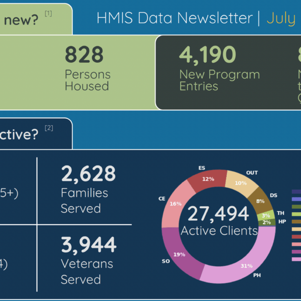
The initial plan was only to highlight inflow and outflow of homelessness from the previous month. However, the team then realized this information needed additional context to have more impact within the community. The first report took an annual look at their data, presenting a 12-month overview of how many people their system served.
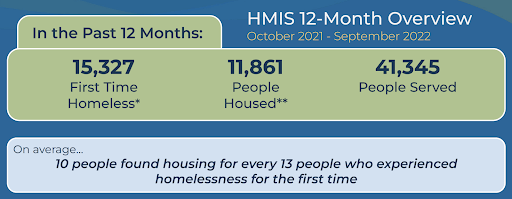
One representative benchmark surfaced in that initial report still referenced by elected officials in San Diego and across the state today: on average, over the last 12 months, ten people found housing for every 13 people who experienced homelessness for the first time. After level-setting the bigger picture, subsequent reports highlighted month-over-month data to offer a more real-time look at the community’s ongoing work to solve homelessness.
“That’s really taking a chapter out of Community Solutions and Built for Zero: if you don’t measure it every month, it’s really hard to know how you’re doing,” Kohler said.
In the beginning, the data team used to review their visualizations and numbers for about an hour each week. Now, with almost a dozen issues published, they spend no more than an hour each month producing it. The heavy lifting is automated, so they run the Python script and check it for quality assurance before publication.
“Now we can stand behind it — we built the capacity and we built the specifications well, so that we can produce it monthly with confidence,” Zeggeye said.
Preparing for launch
“The data report is important, but even more important was knowing how to message it — to really give it a good launch,” Kohler noted.
Before releasing the first edition of the data report, the San Diego team walked through the draft with targeted audience segments, including journalists, elected officials, and their CoC and nonprofit boards, ensuring that the language resonated with them.
“We shared it with them and got their feedback so that, when it was put out, anyone could speak to it and understand its role and purpose, and no one felt like they were blindsided,” Kohler said.
The report is distributed to the community via an email listserv of over a thousand subscribers, posted on RTFH’s website, and shared via Twitter and Facebook. They send it directly to elected officials, and issue a press release for news outlets to be alerted to it each month.
For both Kohler and Zeggeye, another critical factor before the launch of the data report — and each month still — is that their team is aware that they stand by the data released.
“We know that data changes. It can change an hour after we publish it,” Kohler said. “So we aren’t afraid of the fact that the data changes over time, because if you’re doing it every month, it’ll catch up and it will pick up those things over time. Just live with that and move forward with putting out the information.”
Shifting the narrative
The monthly data report has undoubtedly made its impact. The community no longer has to rely on the annual point-in-time (PIT) count numbers as an indicator of homelessness in their community. Required by communities that receive federal funding, the PIT count is an annual count of people experiencing homelessness on a single night, typically held in late January. It is meant to serve as a local snapshot of homelessness and provide an overall scope of homelessness in America. As such, the PIT count is often a driver of communications in many communities — but it’s usually an incomplete and outdated picture that isn’t actionable.
Kohler believes a lot of the report’s value comes from showing the large number of people their system serves while also giving way to talk more about why people are experiencing homelessness.
“It is now just part of the narrative, which is so important,” Kohler said. “So people are now talking about how we can reduce the numbers coming in, instead of the fault of the system not meeting the needs. What does prevention look like? Where are we able to maintain people’s housing? That’s a very different conversation.”
Part of this newer narrative has been to show the fluctuation of numbers within the system while keeping an eye on the bigger picture.
“Now when we released our PIT count results, and our numbers were up substantially, nobody was upset, because they’d been watching our monthly reports and were like: ‘Well, we knew that. Look at what’s been happening,’” Kohler commented.
“Now when we released our PIT count results, and our numbers were up substantially, nobody was upset, because they’d been watching our monthly reports and were like: ‘Well, we knew that. Look at what’s been happening.’”
tamera kohler
Since the launch of the data report in September 2022, the social media post that shares the recent edition of the report usually garners the most attention each month. They also see at least a couple of print publications produce stories about the report’s findings, within the local community and from other areas. The second page of the report contains common definitions to help readers better understand the nuances of the data presented, and reporters will often explore those definitions in their pieces.
Since the launch, the tone of local media reports on homelessness has noticeably shifted, with an increased spotlight on outcomes and solutions and a recognition of the immense work being done and the support needed. The team sometimes jokes about how items from the report are mentioned at every ribbon cutting and every community conversation.
“The place that we knew we really had hit the right messaging is when our mayor used it in the state of the city, and when our chair of our county board of supervisors used it in her state of the county, or when at every council meeting, there is reference to something in that data set,” Kohler said.
Improvement and iteration
Kohler and Zeggeye recognize there is room for improvement moving forward. Much of the content had to be left on the cutting room floor. But they intend to work that in as they continue to iterate. Future plans include depicting seasonal trends, cyclical terms related to funding, and how events like the pandemic have and continue to affect levels of homelessness.
They are also eager to encourage other homeless service providers to pursue a similar route to better inform their own communities.
“It’s not proprietary — nor should it be,” she said. “It’s a lot of hard work from our team, but I wish more of our peers in this space would share when they’re doing this kind of work.”
The biggest question they get from other communities is first, “How did you create it?” followed by: “How did you have the courage to push it out?’”
For Kohler and her team, it wasn’t so much about courage as it was responsibility.
“Data can be such a powerful tool, but it also can be made to say just about anything,” Kohler said. “We must recognize the importance of putting together strong narratives through the data we have.”
“We need to be responsible for narrative and narrative shifts as much as anyone else in this work.”
Visit San Diego’s Regional Task Force on Homelessness’ website to view the monthly HMIS report or email support@rtfhsd.org with questions.